Dell Technologies
Helping IT decision-makers confidently choose a video conferencing room solution they can't afford to get wrong.

Team
Dell Displays and Peripherals
Responsibilities
Product Designer
Timeline
6 months
Device
Web
CONTEXT
Dell aimed to position premium video conferencing solutions, in partnership with Logitech, with a strong emphasis on bundled offerings.
To promote Dell–Logitech conferencing bundles, we redesigned the experience to align with IT buyers’ mental models, focusing on clarity, structure, and ease of navigation. I led UX research and design across key pages, replacing cluttered layouts with a streamlined journey that lets users choose prepackaged solutions or build their own room.
CHALLENGE
Buying a video conferencing room system is a high-cost, high-risk decision and the current page made it harder to take that decision.
Dell's Video Conferencing Room Solutions page struggles with both visual execution and strategic messaging. The "Room Size" anchor link sets up an expectation of a guided selector that never arrives, and the core compute product (Dell Pro Micro Plus XE) is never given a prominent visual moment despite being the solution's differentiator. At a messaging level, the page oscillates uncomfortably between Dell and Logitech branding without establishing a clear hierarchy.
Introducing Video Conferencing Room Solutions
A video-led hero immerses users in real-world conferencing scenarios. Below, a benefits section highlights the advantages of purchasing from Dell, followed by a showcase of the core device and room bundles organized by room size, guiding users seamlessly from exploration to customized configurations.
Room Bundle Details
I redesigned the room bundle overview using progressive disclosure, presenting bundles at a high level while revealing details on demand. This reduced cognitive load from the previous text-heavy experience and made it easier for customers to explore and configure solutions.


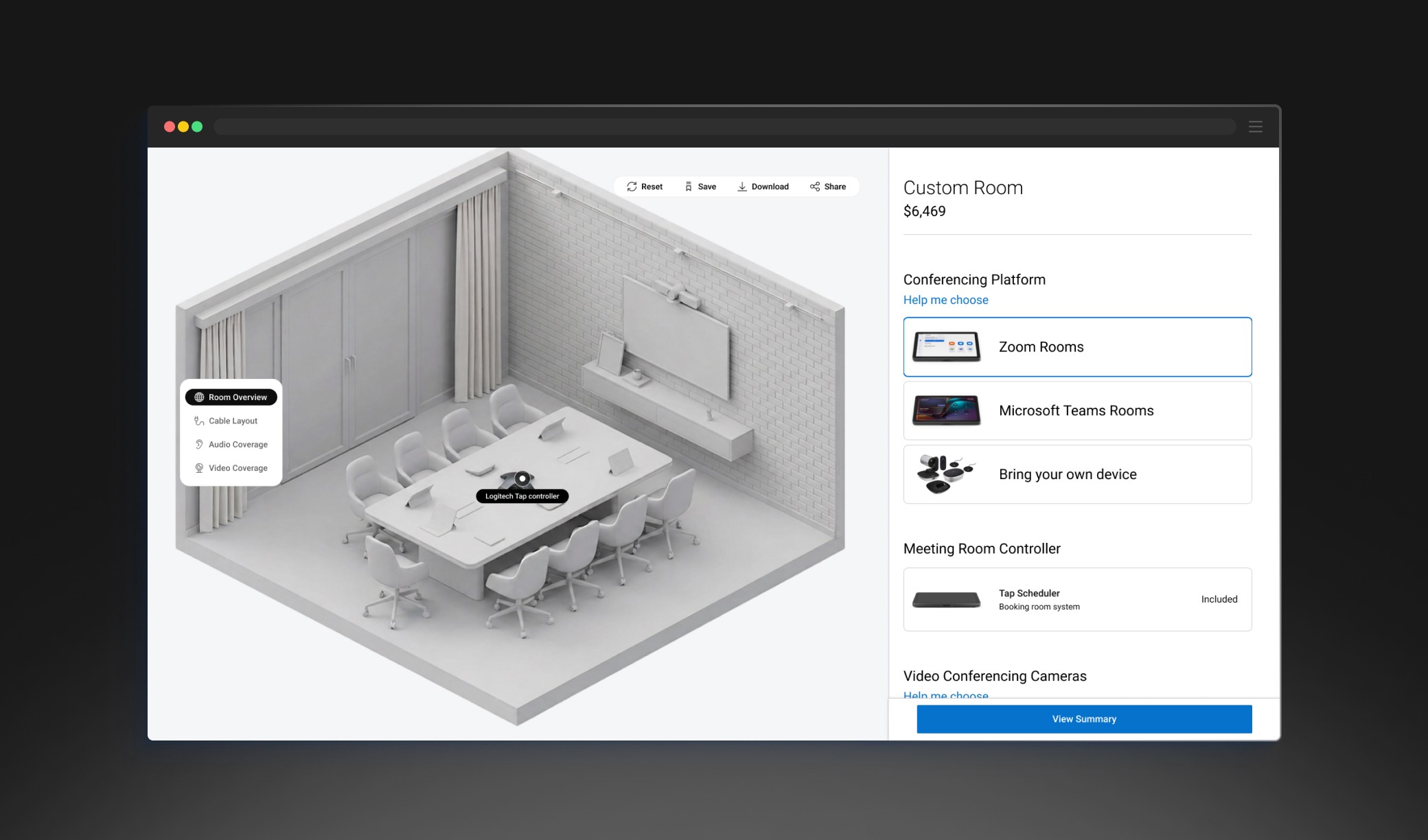
Custom Room Configurator
Enables users to build their own room setup by selecting components, with real-time visualization of audio-visual coverage and cable layout to support confident decision-making.
REFLECTION & OUTCOME
This didn't ship — and I'm still proud of it. Here's why.
The concept didn't go to production due to shifting organizational priorities.
Concept testing validated the structure against users' mental models. The design reduced ambiguity in bundles, compatibility, and pricing.
WHAT I'D MEASURE IF IT SHIPPED
Task success in configuration · Evaluation-stage drop-off · Time-to-confidence
TAKEAWAY
The deepest friction comes from users not being able to interpret the consequences of their choices.